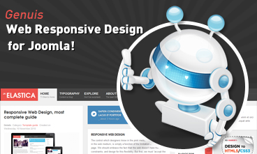 Resize browser to see the magic. And experience the ride with your wide screen, laptop, ipad, kindle, iphone or any handheld device.
Mobile layout
- Details
- Kategorie: Template guide
- Veröffentlicht: Dienstag, 09. März 2021 09:00
- Zugriffe: 2301
There are 2 layout types for mobile. The first one is Tablet Portrait layout and Tablet Lanscape layout ( the Landscape layout is the Normal Layout). The mobile layout uses percentage (%) as unit to define width of the layout. The full width of the layout is 100%, from that, you can define width for each element in the template.
Mobile Landscape layout
Front-end Appearance
To define width of the layout, please navigate to: [your_site] / templates / ja_elastica / core / etc / layouts / default.xml. The file default.xml is to define width range of each layout.
{codecitation}As defined here, the layout has maximum width = 719 px. And with the condition, the layout will use the layout-mobile.css file under the your_site/templates/elastica/css folder to be the style of the layout ( the Css file contains configuration for style of the layout including: width, font size, logo size, ... )
{codecitation} .main { width: 100%; } .column { float: none; width: 100% !important; } /* MASONRY PRESETS (240px*5 Grids) --------------------------------------------------------- */ /* Sizes---*/ .ja-masonry { width: 49%; } .grid-double, .grid-tripple { width: 100%; } {/codecitation}As defined in the code above, the width is re-defined. In mobile landscape layout, the ja-masonry (grid) is converted to percentage (%). One grid is now = 49% width in mobile landscape layout, and grid-double, grid-tripple are now = 100% width (full width). You can change the rate here.
Mobile Portrait layout
Front-end Appearance
To define width of the layout, please navigate to: your_site/templates/elastica/core/etc/layouts/default.xml. The file default.xml is to define width range of each layout.
{codecitation}As defined here, the layout has maximum width = 479 px. And with the condition, the layout will use the layout-mobile-port.css file under the your_site / templates / elastica / css folder to be the style of the layout.
{codecitation} /* MASONRY PRESETS (240px*5 Grids) --------------------------------------------------------- */ /* Sizes---*/ .ja-masonry, .grid-double, .grid-tripple, #ja-header .main, #ja-content, .item { float: none !important; width: 100% !important; } {/codecitation}As the code defined, in the mobile portrait layout, .ja-masonry, .grid-double, .grid-tripple are now = 100% width (full width) ---> content and modules have same size (all are = 100%).

 Etiam pellentesque magna id lacus imperdiet ac vulputate enim semper. Donec tincidunt.