 Resize browser to see the magic. And experience the ride with your wide screen, laptop, ipad, kindle, iphone or any handheld device.
Search
Popular Tags
Badge top
Lacinia mollis leo wisi ridiculus sed pellentesque condimentum condimentum nunc tincidunt.
Template features
1. Responsive
Pellentesque auctor leo fringilla pulvinar.
Pellentesque auctor leo fringilla pulvinar.
2. Grid System
Pellentesque auctor leo fringilla pulvinar.
Pellentesque auctor leo fringilla pulvinar.
3. Multiple Block style
Pellentesque auctor leo fringilla pulvinar.
Pellentesque auctor leo fringilla pulvinar.
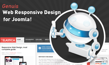
JA Elastica is our first responsive web design!
Badge hot
Vitae vitae urna eros curabitur ipsum et eget lorem sem nibh. Dui nunc pharetra tincidunt urna nibh.
Badge new
Pellentesque sed aliquet mauris iaculis pretium dapibus porttitor. tincidunt sem quam Morbi nulla elit a tortor vitae.
Red module
Sapien condimentum tellus ac In a eget molestie lacus et porttitor.

My love song
 Etiam pellentesque magna id lacus imperdiet ac vulputate enim semper. Donec tincidunt.
Blue module
Sapien condimentum tellus ac In a eget molestie lacus et porttitor facilisi.
Violet module
Sapien condimentum tellus ac In a eget molestie lacus et porttitor.
Who's Online
Aktuell sind 114 Gäste und keine Mitglieder online
Dark module
Sapien condimentum tellus ac In a eget molestie lacus et porttitor.
Green module
Sapien condimentum tellus ac In a eget molestie lacus et porttitor.
Joomla Tutorial
How to Apply a Module Class Suffix in Joomla 2.5?
- Login to backend.
- Go to the Module Manager.
- Select the Module you want to edit.
- Type the Module Class Suffix into the parameters to the right.
- Save the Setting.
Banners
Loading ...