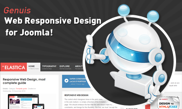 Resize browser to see the magic. And experience the ride with your wide screen, laptop, ipad, kindle, iphone or any handheld device.
Tablet layout
- Details
- Kategorie: Template guide
- Veröffentlicht: Dienstag, 09. März 2021 09:00
- Zugriffe: 2080
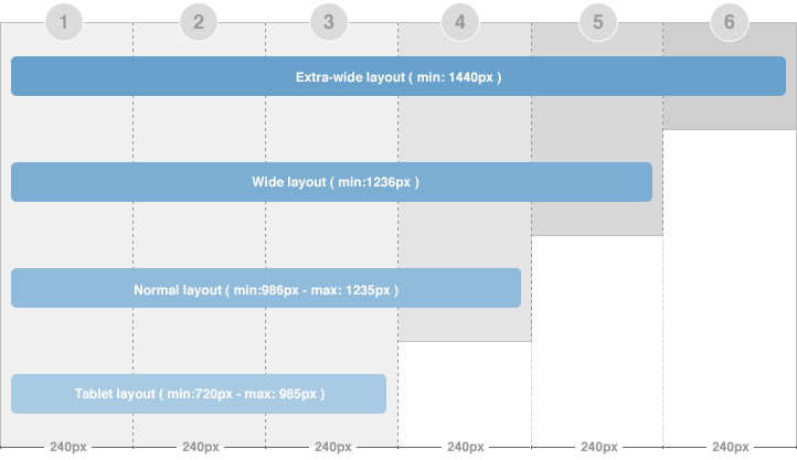
There are 2 layout types for tablet. The first one is Tablet Portrait layout and Tablet Lanscape layout ( the Landscape layout is the Normal Layout).
The Portrait layout uses 3 grids. The content block has width of 3 grids in both homepage and detail page so all modules will be displayed under the content block.
Mobile layout
- Details
- Kategorie: Template guide
- Veröffentlicht: Dienstag, 09. März 2021 09:00
- Zugriffe: 1997
There are 2 layout types for mobile. The first one is Tablet Portrait layout and Tablet Lanscape layout ( the Landscape layout is the Normal Layout). The mobile layout uses percentage (%) as unit to define width of the layout. The full width of the layout is 100%, from that, you can define width for each element in the template.
Mobile Landscape layout
Front-end Appearance
To define width of the layout, please navigate to: [your_site] / templates / ja_elastica / core / etc / layouts / default.xml. The file default.xml is to define width range of each layout.

 Etiam pellentesque magna id lacus imperdiet ac vulputate enim semper. Donec tincidunt.